Mapping a Queer New York: An Interview with Jen Jack Gieseking
INTERVIEWED BY KATIE UVA
Today on the blog, Katie Uva interviews Jen Jack Gieseking about their mapping project, An Everyday Queer New York, a companion project to his book A Queer New York: Geographies of Lesbians, Dykes, and Queers, forthcoming in 2020. Jack discusses the challenges and opportunities in mapping as a way of understanding lesbian, gay, bisexual, trans, and queer (LGBTQ+) history in general, and the history of queer women and trans and gender non-conforming people (tgncp) in particular.[1]
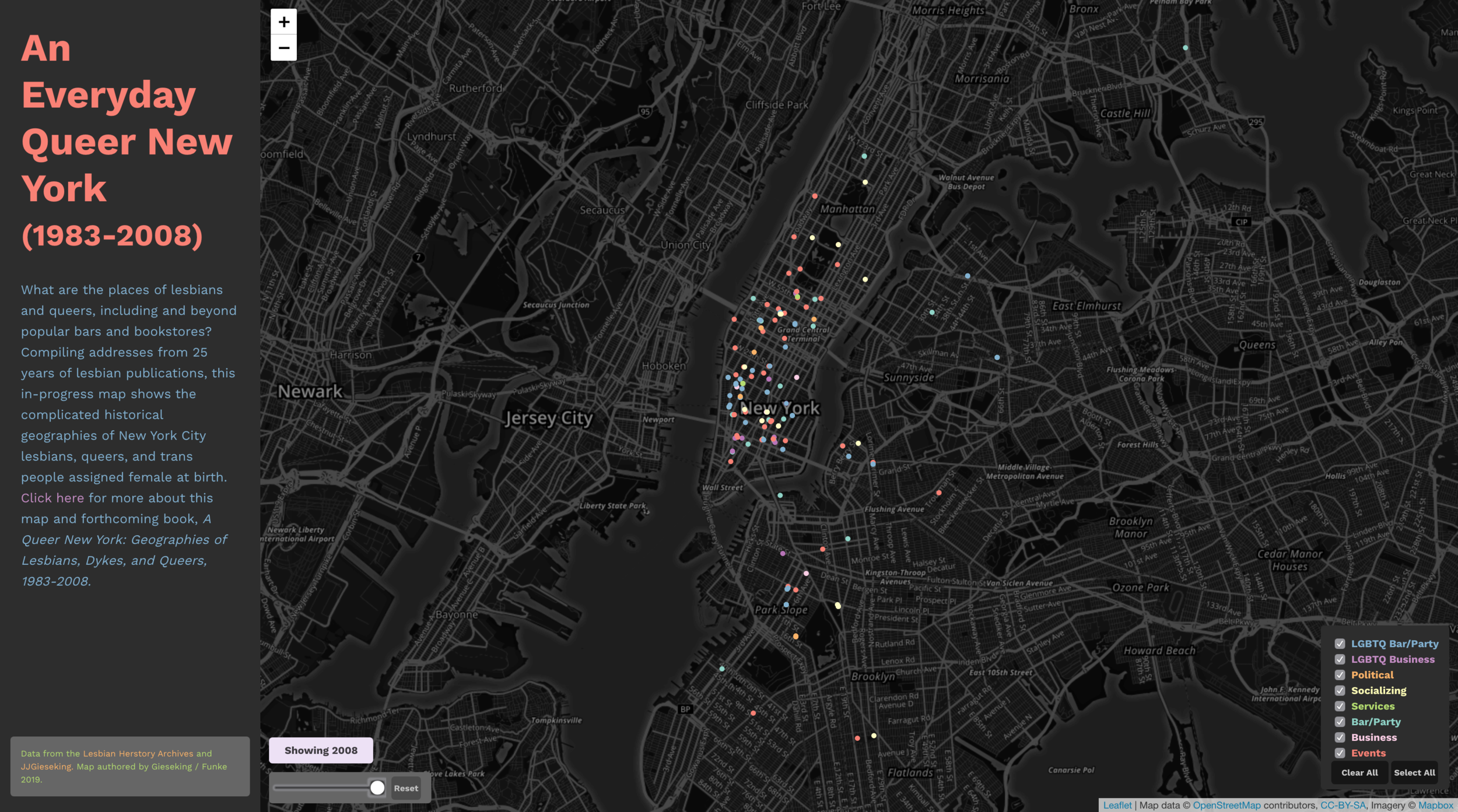
A snapshot of “An Everyday Queer New York.”
What was the inspiration for the Everyday Queer New York website?
I conducted the original research for my forthcoming book, A Queer New York: Geographies of Lesbians, Dykes, and Queers, with a total focus on how best to record and tell the multi-generational stories of women and tgncp in their own words. The book and forthcoming maps on the companion website, An Everyday Queer New York, are a way for me to visually express the everyday stories of urban lesbian and queer lives (mostly women and tgncp assigned female at birth) in a public, accessible format. While lesbian, gay, bisexual, trans, and queer memoirs and a handful of LGBTQ+ historical monographs and one sociological monograph on New York City, my book is the first lesbian-queer history of New York City.[2]
Maps have a lot of power because once a place is mapped, it becomes all the more real or official, and it can even become “history.” But how to map lesbians and queers is a complicated practice because lesbians and queers have a much wider range of everyday spaces than has been recorded in most popular LGBTQ+ history. I launched the companion website with its first map of over 1,600 places listed in New York City lesbian periodicals (1983—2008). All of the coding/design is thanks to Lindsey Funke (UKY MA ’20) whose interactive mapping skills took this to the next level. In part, the map also affords a way to tell many of the amazing stories that I couldn’t fit in my book.
The book primarily draws from cross-generational group interviews I led with 47 lesbian and/or queer participants, including hand-drawn mental-mapping and artifact-sharing exercises. I also conducted a year’s worth of archival research into the organizational records and periodicals at the Lesbian Herstory Archives (LHA) in Brooklyn, the largest lesbian archive in the world. In the end, I had more than 1,400 pages of group interview transcripts with 47 participants, 47 mental maps (hand-drawn maps of lesbian-queer places and experiences across the city) and personal artifacts, annual and sometimes monthly details with addresses from 389 organizations’ records, and 26 years of periodicals. I admit to my advisor, finally: yes, I did too much. With all of that data then, for me, the map was largely inspired by this question: how can I bring to light the archival research I couldn’t devote as much attention to in the book, and make a public, accessible site that would excite people about lesbian and queer history?
What are your criteria for determining whether a location should be included in your map? How did you identify these locations?
The final map of An Everyday Queer New York will actually build from three very different datasets, each with their own measure of what determines a dot on the map—as well as what should be kept off the map. The three layers/datasets of the map include two layers from the archival data and one data layer from interviews: the locations listed in twenty-five years of published lesbian-queer periodicals from the archives.
The locations listed in twenty-five years of published lesbian-queer periodicals from the archives.
The locations of LGBTQ+ organizations that focused on lesbian-queer concerns and held a New York City office.
Every location mentioned by each of my 47 research participants, creating 47 maps of their individual constellation of places with key quotes, images of these places, as well as their mental maps.
During my postdoctoral fellowship, I found a fabulous undergraduate, Gina Stalica (Bowdoin ’16), who worked with me to go through thousands of pages of lesbian-queer publication to record every address listed. She captured over 1,600 unique locations in a spreadsheet that are now online in An Everyday Queer New York.
Yet the organizations database—and I am still grateful to my colleague Erin Siodmak who also helped to collect addresses—contains a lot of information I would never make public. That map isn’t public yet because I am presently reviewing the data for a third time to keep safe the personal addresses for the lesbian and queer organizers who opened their home for an event or meeting or merely received organization mail there. It took over a year to clean and mask the data of more than 700 more sites.
Organizational interests were varied, from the renowned Lesbian Avengers, Queer Nation, and ACT-UP to small organizations like the Orthodykes of New York for Orthodox Jewish lesbians (1999–present); the Star Trek fan club U.S.S. Northstar NCC-10462 (1991–1999); sex party organizers Lesbian Sex Mafia (1981–present); the transgender and cross-dressing social and political organization Imperial Kings and Queens of New York (1968–present); Hykin’ Dykes renamed as Women About (1988–present); and STP (Swing the Pussy), an antiviolence and information-sharing broadsheet newsletter (1998– 2002).[3] I am really excited to publish this map of organizations as soon as possible.
The last map will include my 47 individual participants’ own places and spaces, and you will be able to see each woman’s or tgnp’s individual layer. Much gratitude to Sam Fischer (Trinity ’20) worked closely with me to go through the transcripts and list every location a person mentioned. Since these are group interviews, you may get five participants going back and forth listing tons of places and spaces important to them, from the physical to the virtual. Say I have a participant named Jane who came out in 1985 who says in an interview, “I walked over to the Center before heading out to the Cubbyhole for a date. I was listening to Meshell Ndegeocello on my Walkman.” Then the LGBT Center, Cubbyhole, Walkman, and even Meshell Ndegeocello are listed as locations on her map. For all 47 participants, this turned out to be over 1,000 places, from the 1 train to Zen Palate! This still wows me!
You are probably wondering: how will I map all of the art, music, books, and films that my participants took solace and found a place to rest in? These spaces are just as present and important as the LGBT Center or the Center for Anti-Violence Education. I am wondering that too and not sure at all yet, although I think this part of my project lends itself to thinking beyond Cartesian colonial grids and that feels like the absolute right direction for this map. I often feel like being an uncertain cartographer while also being careful, studious, and courteous cartographer is part of the project of queering mapping. That is the approach required to work from and against the categories of white heteropatriarchal capitalism that shape our lives, the same categories that queers refuse to be shaped by. I hope to have this part online by 2021.
How did you determine your parameters for categorizing locations and for what time period to include?
Oh gosh, the categorization process has been epic! Queers just hate binaries and boxes and fixed categories, so this work is slow and requires much care. Michael Brown and Larry Knopp, two amazing queer geographers, spent a great amount of time collaboratively making a multi-generational, across-race, across-class, and multi-gender map of Seattle’s LGBTQ+ history.[4] Brown & Knopp’s participants had to show up at the table and wrestle with these sorts of questions: What makes a queer space? Does it have to be recorded in a periodical? How many people have to attend? What kind of people? What kind of people were kept out of there? Or didn’t know about it? And so on. And this was before they even decided the map’s borders, legend, colors, and fonts.
My own categorization schema felt like it took forever to sort out. I originally hatched 24 different types of LGBTQ+ organizations. However, you can’t have a map with 24 categories (i.e., colors of dots) and expect anyone to read it and understand it, let alone not get ill. It took a year of going back and forth on the categories and making all sorts of lists. Finally, I realized I had to give up trying to primarily categorize them by the organization’s mission, and instead use the type of gathering: mailing, office, meeting, zaps, and event locations of organizations. These five categories regarding types of gathering already reveal patterns between where my organization members lived (mailing) and held events, as often distinct from areas in which they enacted zaps (a queer activist intervention). You will still be able to sort by type of organizational mission but this won’t drive the color schema/legend.
Selecting the time period was much easier—or maybe it seems easier because I chose it so long ago. My research originated through a series of contradictions that arose for me in both academic and popular literature that I read through my experience of being a queer, lesbian, butch, trans dyke living in New York City. I saw that coming out under varying political, economic, and social situations structured LGBTQ+ people’s understanding of themselves and the world. I felt strongly that framing a simple binary of pre-/post-Stonewall generations needed to be upended—all the more so during the ultra-hyped 50th anniversary of Stonewall this year—for LGBTQ+ people to recognize our multiple interdependent and complicated histories.
The significance of generational shifts is highly evident in queer life when you compare coming out in 1983 early on in the AIDS epidemic (when I was in first grade, being taught that all homosexuals were pedophiles), versus 2008 when there was a long-held discourse of LGBTQ+ rights and heightened media around lesbians. When I wrote this book and made these maps in the 2010s, LGBTQ+ history had broadened but was still reduced to a version of Stonewall riots, now along with the rise of ACT UP in the face of the AIDS epidemic and homophobia. The data in this project end in 2008/2009 because that is when data collection ends.
I have nothing but respect for people who partake in the arduous work of collectively and independently articulating meanings of queer space with/by/for/about queers. It is a difficult and important work. I created my categories on my own based on my other research, but I am always eager for user feedback. Therefore, it’s inevitable and important that map users will ask me to re-categorize places, let alone create new categories of lesbian-queer places. It’s hard work but I’m up for it. How else are we going to make sense of our lives?
How does your map tell a different story than, say, the NYC LGBT Sites Project or the Addresses Project?
I am so glad you asked about these other NYC queer mapping projects. My project, unlike the fabulous work of the NYC LGBT Sites Project, makes no aim at preservation or defining any site as historic. The scholars and preservationists behind that site have created proposals at the city, state, and national levels to protect those sites. Also, compared to the stunning work that Gwen Shockey has done in the Addresses Project, which highlights stories of bars in oral histories with lesbian and queer community leaders, I’m really keen to hear the story of every lesbian and/or queer person who would share their stories with me. Getting these historic and leader-defined sites is immensely important to queer history and to queer understanding, and I think my map is another way of seeing those stories. Finally, while not mentioned in your question, equally not to be missed is Jeff Ferzoco’s OutGoing NYC which aims to map the complete history of LGBTQ+ nightlife from a really wide range of historical sources. That map goes back to 1859! Walt Whitman could have drunk and cruised in these pubs! Amazing. Beyond projects mapping NYC or NYC-alone, Queering the Map and the recently launched QueerMaps are important LGBTQ+ mapping sites to check out.
In the maps my colleagues have done, bars play a central role. And yet bars are now understood more as historic sites than common hangouts as so many have closed, and this was even the case when I finished conducting research a decade ago. But my interest in the every day for An Everyday Queer New York is sparked by how much these spaces are shaped by gender. Only two lesbian bars remain in Manhattan as of 2019 with a third in Brooklyn, and the fourth bar in Queens—Bum Bum Bar, the only bar serving primarily women and tgncp of color—closed this year. My participants describe decades of racism, classism, and ableism in bars so that as much as LGBTQ+ people want to romanticize them (and, sure, they sometimes deserve it), bars were also restrictive if not exclusionary for many LGBTQ+ people. And yet many bars and many parties persisted, which these three maps reveal, and so I look at these three maps a lot. I think they’re each so gorgeous and, as a geographer, they always teach me something new and, as a queer, they help me feel less alone in the world and part of something bigger.
I really think the only way to understand NYC queer history or any queer history for that matter, is to understand that it will always be partial. In other words, you can only really understand lesbian-queer history by immersing yourself in all of these maps and the stories and archives (Fales at NYU, LGBT Collection at NYPL, The Center Archives, and Lesbian Herstory Archives) they came from. I cannot tell you how many times participants told me completely different if not conflicting experiences about the same venues, from bars like the Duchess or Meow Mix to places that were definitely not bars like Tea Lounge and the Park Slope Food Co-op. For some, it was the most welcoming, cutting-edge, and or hip place and, for others, the most rejecting, exclusionary, or boring site. Because lesbians and queers of all races make considerably less money than white gay men and straight couples, which is all the more amplified for Black, Latinx, and Indigenous women, tgncp, and Two-Spirit people, they have fewer spaces to go to and fewer times to go out, especially those that require spending a lot to keep them open like bars. What I mean here is that lesbians and queers and even most LGBTQ+ people cannot go out to all the places all of the time and so we each have these partial snapshots of what the “queer scene” or “queer world” is. Each of these maps is a queer New York unto itself, and the complexity only reveals itself in conversation.
What trends does your project identify?
The map rearticulates many of the ideas in my book, and also offers new patterns. A Queer New York: Geographies of Lesbians, Dykes, and Queers is a historical geography of lesbian and queer urban political economy, and it is the first lesbian history of New York City. In it, I describe lesbian and queer spaces as being more fragmented and fleeting in response to the white heteropatriarchal capitalism that does not make room for them. These places come and go like stars in the sky and are bound by the paths these women and tgncp take between them in what I call constellations. I argue that constellations are an alternative geographical imagination for reading the city that does not succumb to liberation-through-property ownership. This lack of fixity is all the more extreme for women and tgncp, and for Indigenous, Black, Latinx, and many Asian people under structures of white colonial cis-heteropatriarchy.
Even while arguing for this rethinking of the geographical imagination of lesbian-queer spaces, I still had to contend with the role of gay, lesbian, and queer neighborhoods in my participants’ geographical imagination. Specifically, I addressed how the myth of territorial liberation—proximal residential and commercial ownership in the form of a gayborhood—fails most LGBTQ+ people, especially women, tgncp, and Two-Spirit people, as well as LGBTQ+ people of color, Indigenous people, and working-class LGBTQ+ people. To that end, the book focuses on the neighborhoods of Greenwich Village, Bed-Stuy, Crown Heights, and Park Slope in order to show how each works and, more often, doesn’t work to afford my participants the community they seek, and instead how constellations grow in and across these neighborhoods.
Now when we look to the map of places listed in periodicals—and I admit you need to be a New Yorker to see these patterns until I create videos that walk folks through—there are really significant patterns I didn’t see in my interviews. Indeed, the constellations of stars I describe in the book are so very clear across the city on the map. Perhaps the greatest of these trends is in Midtown, below Central Park. I have always thought of Midtown as where fun goes to die since it’s a corporate workspace. But you can see as many lesbian-queer gatherings there as, say, the Lower East Side. In seeing this pattern, I realized that lesbians and queers have different day and night geographies, because Midtown is cheap to rent at night and create privacy where no one expects you. It’s amazing what lesbians and queers can do, eh?
Why were you drawn to mapping to tell this story? How will this project work in tandem with your book once it's published?
Ha! I honestly tried not to make a map for years since, as an urban and digital geographer, everyone expected me to make a map. But after I made the graphs about the Lesbian Herstory Archives data, it became all too obvious a map was warranted, not only given the location data I collected—that was not showing up on any other queer maps—but also how much more accessible maps are as ways to take in a great deal of information very quickly and make sense of the world. Maybe our determination to map ourselves is also a determination for some of us to gain acceptance (from others or from ourselves), while for others it’s a claim to space, and still others it’s an effort to document an invisible history. Between AIDS and gentrification, we have lost so many people and so many spaces so that these maps also document queer failure as much as they document queer methods of survival and, even, thriving.[5] I hope these meanings come out for those who read the book or those who merely want to experience and wander through the map.
What recommendations do you have for using this map as a teaching tool? How else would you like the map to be used?
Over the years and as my coding skills approve and I get new grants, I’ll add neighborhood boundaries, census database layers (namely race and income and rent values), subway lines, and other markers to the map to An Everyday Queer New York. I’ll also be making videos that walk users through how to use the map and read this version of queer New York (I, too, find it annoying when New Yorkers assume the rest of the world knows New York City’s geography). In the meantime, there is a great deal to be learned by looking at clusters and absences, and lines of dots and where they end and begin. It’s also great to use the slider to see how the number of places changed over time (and how limited periodicals are when they didn’t record many places in a year). And, finally, it’s just great to sit back and marvel at all that labor, lust, and/or love that rained down that dyke confetti of politics, socializing, sex, and relationships all over New York City for generations.
Jen Jack Gieseking is an urban cultural geographer, feminist and queer theorist, and environmental psychologist. He is engaged in research on co-productions of space and identity in digital and material environments. Their work pays special attention to how such productions support or inhibit social, spatial, and economic justice in regard to gender and sexuality. Jack is the Assistant Professor of Geography at the University of Kentucky, where they teach courses on digital studies and queer geographies. He can be found at jgieseking.org or on Twitter at @jgieseking. Their book, A Queer New York: Geographies of Lesbians, Dykes, and Queers, is forthcoming from NYU Press in 2020.
Acknowledgment
I doubt I ever would have embraced this mapping project if I had the very good fortune of meeting Evan Misshula while we were both still at the CUNY Graduate Center (Evan is now Associate Director of Research for the Correctional Association of NY, and has taught coding at Rikers). Evan encouraged me to take the vast amount of LHA data I had on LGBTQ+ organizations in New York City and turn them into data visualizations, first even as simple graphs to know how many LGBTQ+ organizations existed per year in New York City. No one knew that story or had the data to ask it before in this way—a really vast and important archive yet to be visualized—and I didn’t even think to ask it until Evan pushed me to see the data, and I was hooked. I became determined to visualize the stories of a group all too often called “invisible.”
[1] Gieseking uses LGBTQ+ to signal questioning, intersex, Two-Spirit, and other gender and sexual identities do not fall under the now popular version of the acronym.
[2] I titled this book A Queer New York as an homage to historian George Chauncey’s important Gay New York which greatly inspired my own research. Sitting alongside the work on LGBTQ New York City by George Chauncey, Christina Hanhardt, Hugh Ryan, and Mignon Moore, the “A” in the title is meant to signify the many stories of lesbian-queer New York City are yet to be written, and my book and its companion website are only a part of that effort.
[3] I reference the same list in Jen Jack Gieseking, “Size Matters to Lesbians Too: Queer Feminist Interventions into the Scale of Big Data,” Professional Geographer 70, no. 1 (2017): 150–56.
[4] Michael Brown and Lawrence Knopp, “Queering the Map: The Productive Tensions of Colliding Epistemologies,” Annals of the Association of American Geographers 98, no. 1 (2008): 40–58.
[5] Cf. Jack Halberstam, The Queer Art of Failure (Durham: Duke University Press, 2011).